RAFINER
REDESIGN OF LIFESTYLE PORTAL


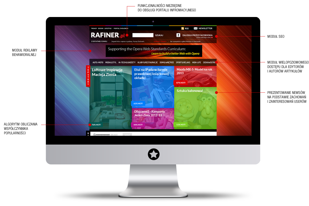
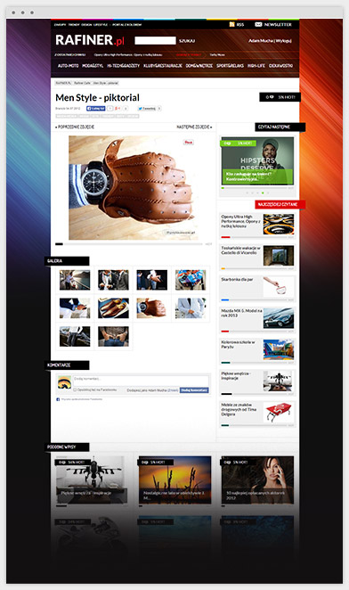
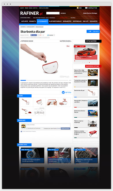
Rafiner is an online magazine for those who crave the coolest new trends in fashion design and leisure, and is aimed at passionate and expressive individuals. To capture their attention Rafiner required a website which itself was on-trend.
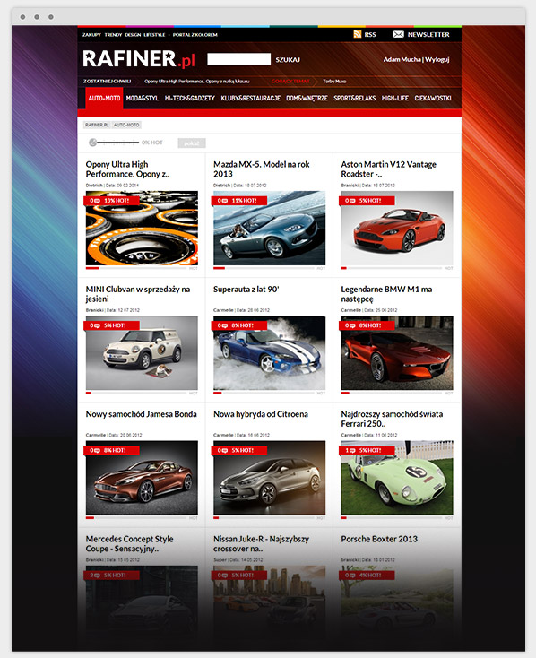
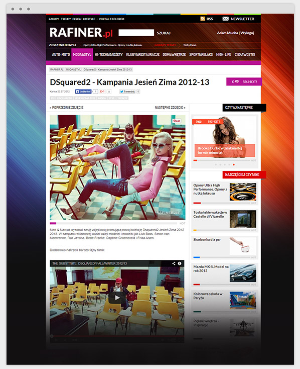
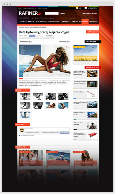
To achieve this, we redesigned the front-end of the website to give it a more slick and stylish look. More importantly we overhauled the CMS to make sure that the client could effectively manage content on the site, making their lives easier.
For the design elements of the website, we took inspiration from Dutch abstract painter Piet Mondrian, and his masterpiece ‘Composition with Yellow, Blue and Red’. This led to a design which is built around geometry and bold colours, the shapes working alongside vibrant colours to give the website a tasteful and modern feel. The distinctive design works perfectly with a state-of-the-art system that enables the user to personalize, rate and suggest content.
We dedicated additional work to create extended advertisement modules, an entry management module, and integrating the tools required to bring the website up to standard with current requirements for SEO best practice.
PROJECT LEAD

Adam Mucha
How about talking with
Adam about how experience
he gained in this project
can be a help in achievieng
your goals.
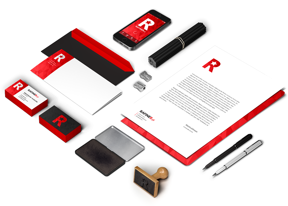
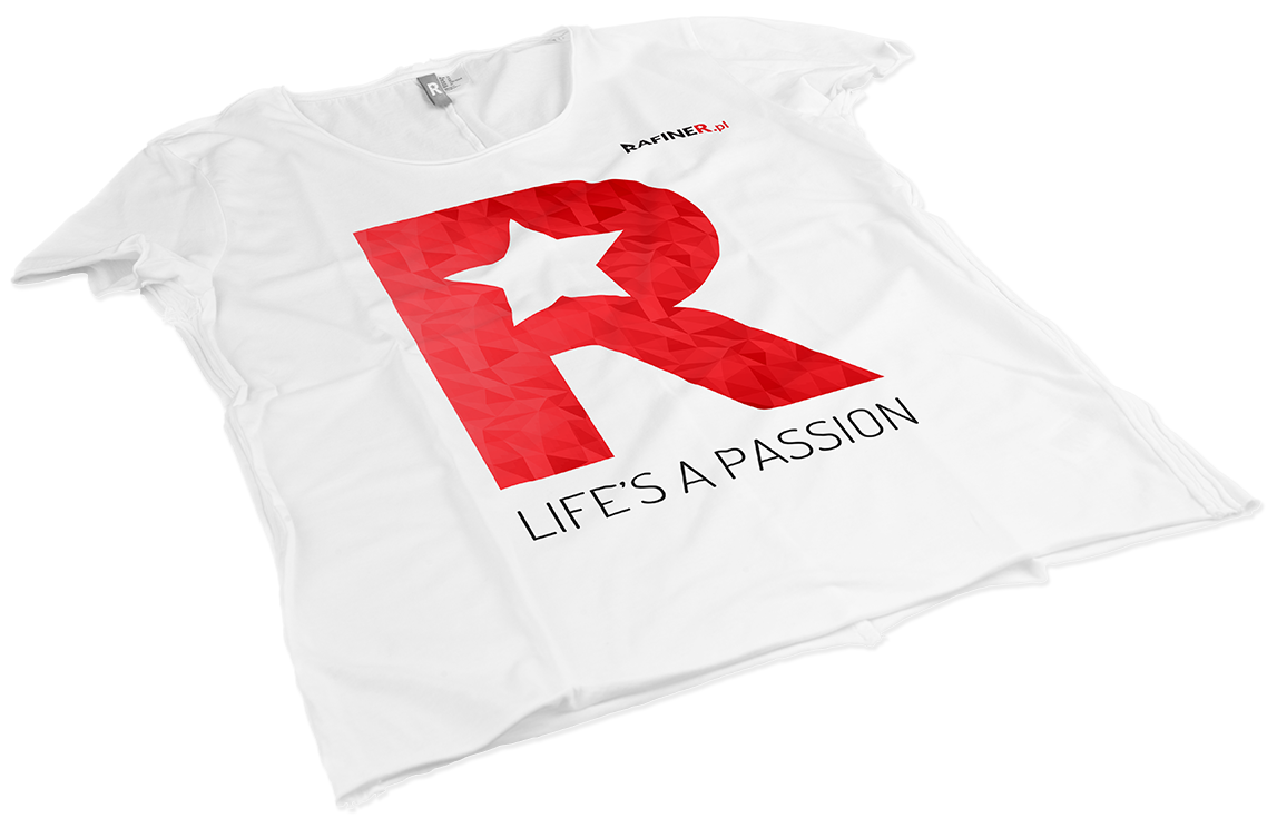
LOGO

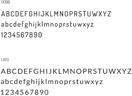
TYPOGRAPHY

COLOURS


