KFD
ONLINE SHOP AND BRANDING

Online shop – a large saving of money, great convenience, but also a big challenge. Why?
Because if it is poorly designed, it can not only significantly reduce the sales but also lead to the demise of the entire investment. On the other hand, a well-thought-out online store adapted to its target, increases the revenue in a short time – regardless of the industry.
That is why we were so happy to receive a commission from KFD – the largest Polish wholesaler of nutrients and dietary supplements. The wide range of products meant quite a challenge in terms of User Experience, which we were eager to face.
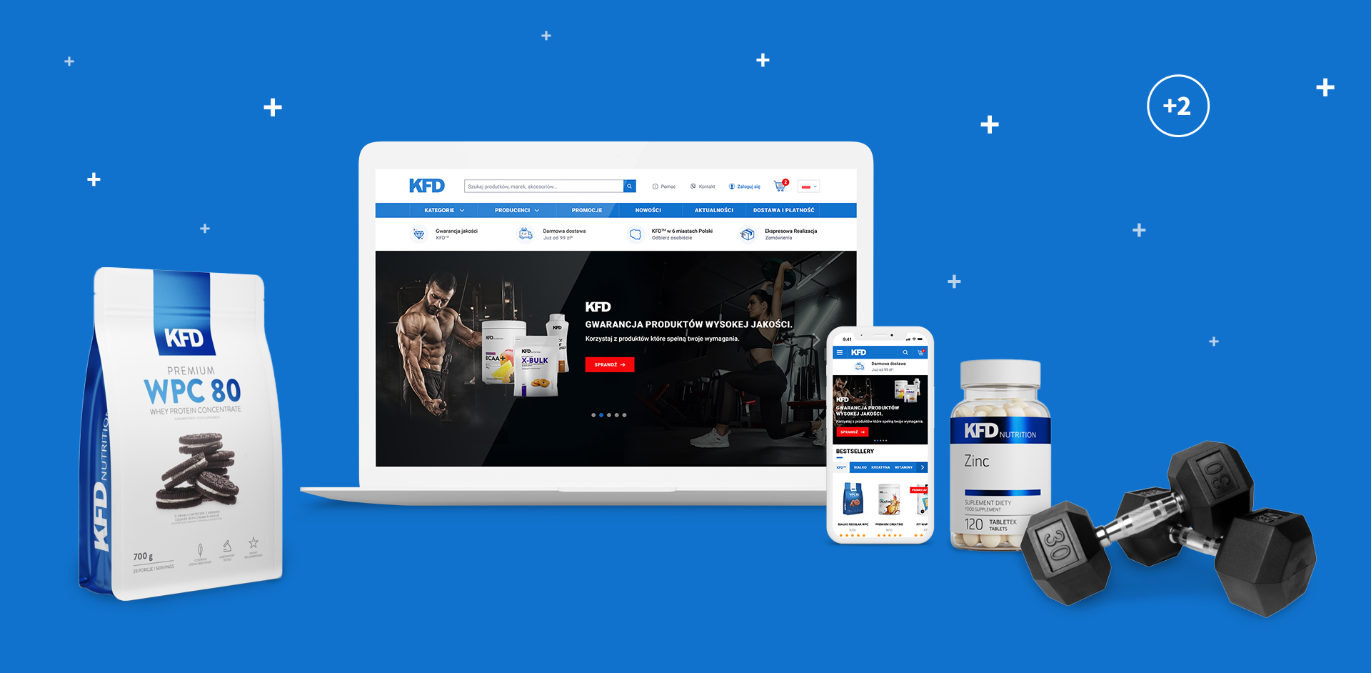
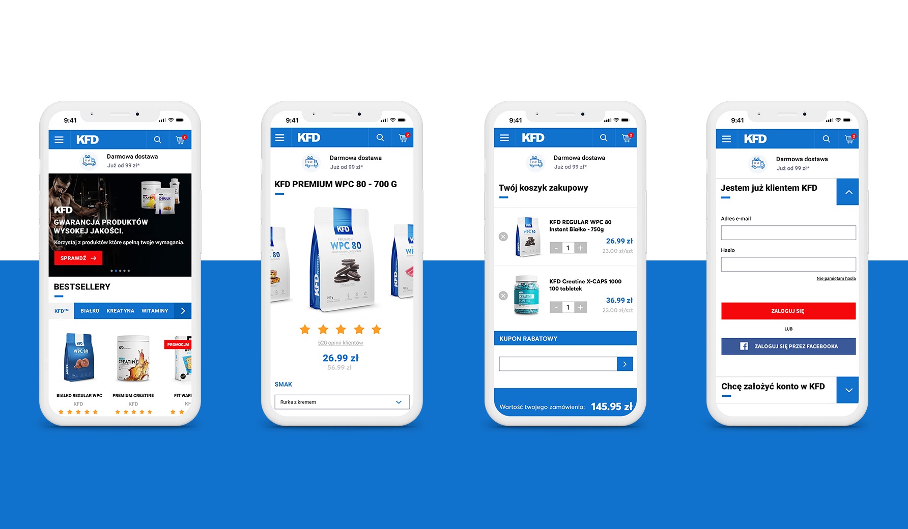
The whole project was based on the “mobile first” principle – clear layout, easy navigation, an always visible shopping cart and quick access to the search engine significantly increase the user’s convenience at every shopping stage.
We also did not forget about emphasising the USP – Unique Selling Proposition allowing the user to immediately see the features distinguishing KFD among the competition, well-thought-out product filters and obvious CTAs (Calls To Action) that clearly indicate where to click to go further.
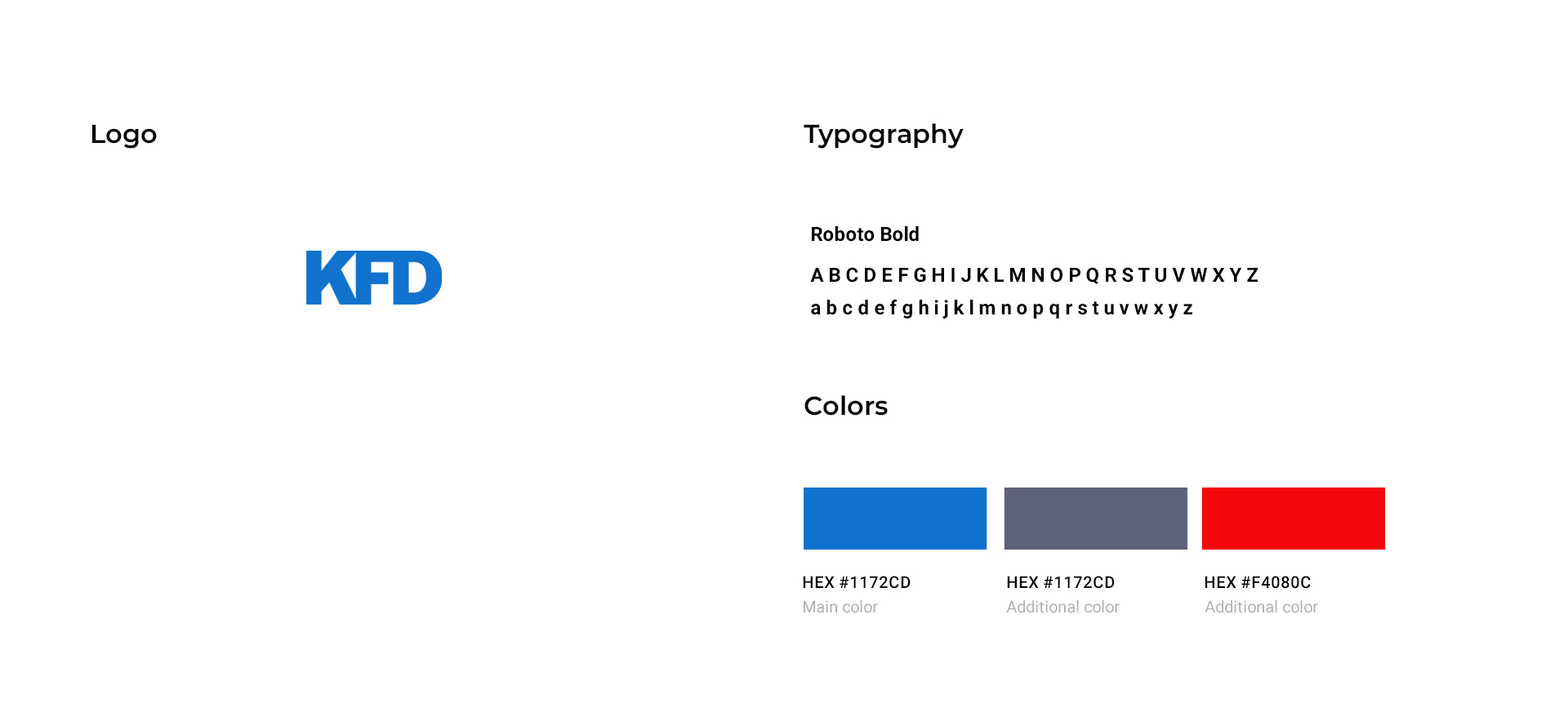
The icing on the cake was adding a dedicated iconography that completes the strong and expressive design created especially with the KFD’s target group in mind ????
PROJECT LEAD

Adam Mucha
How about talking with Adam about how experience he gained in this project can be a help in achievieng your goals.

ICONOGRAPHY


MOBILE

WEBSITE


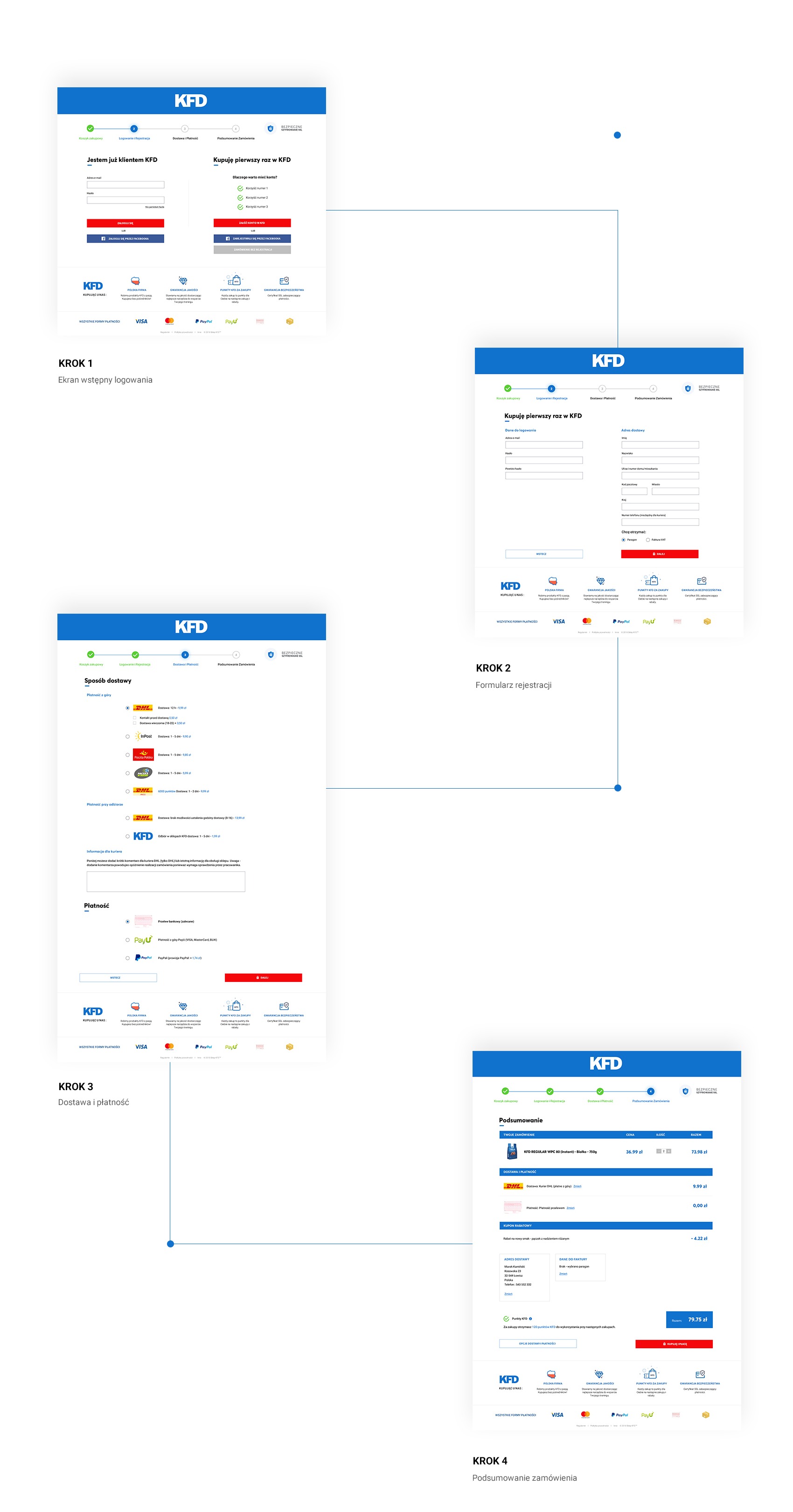
PURCHASING PROCESS
