AASA POLAND
A USER-FRIENDLY LOAN PLATFORM
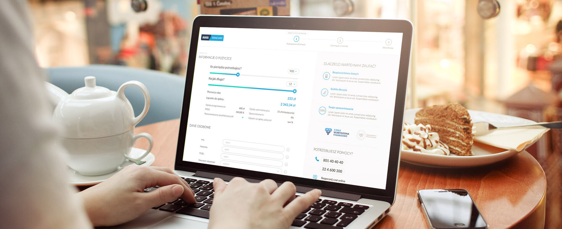

We value good user experience above everything else when it comes to creating websites, and this was a major part of the reason why we were approached by AASA. They offer small loans based on simple easy to understand terms, and they wanted us to communicate this via a website which was similarly straight-forward and easy for users to understand.
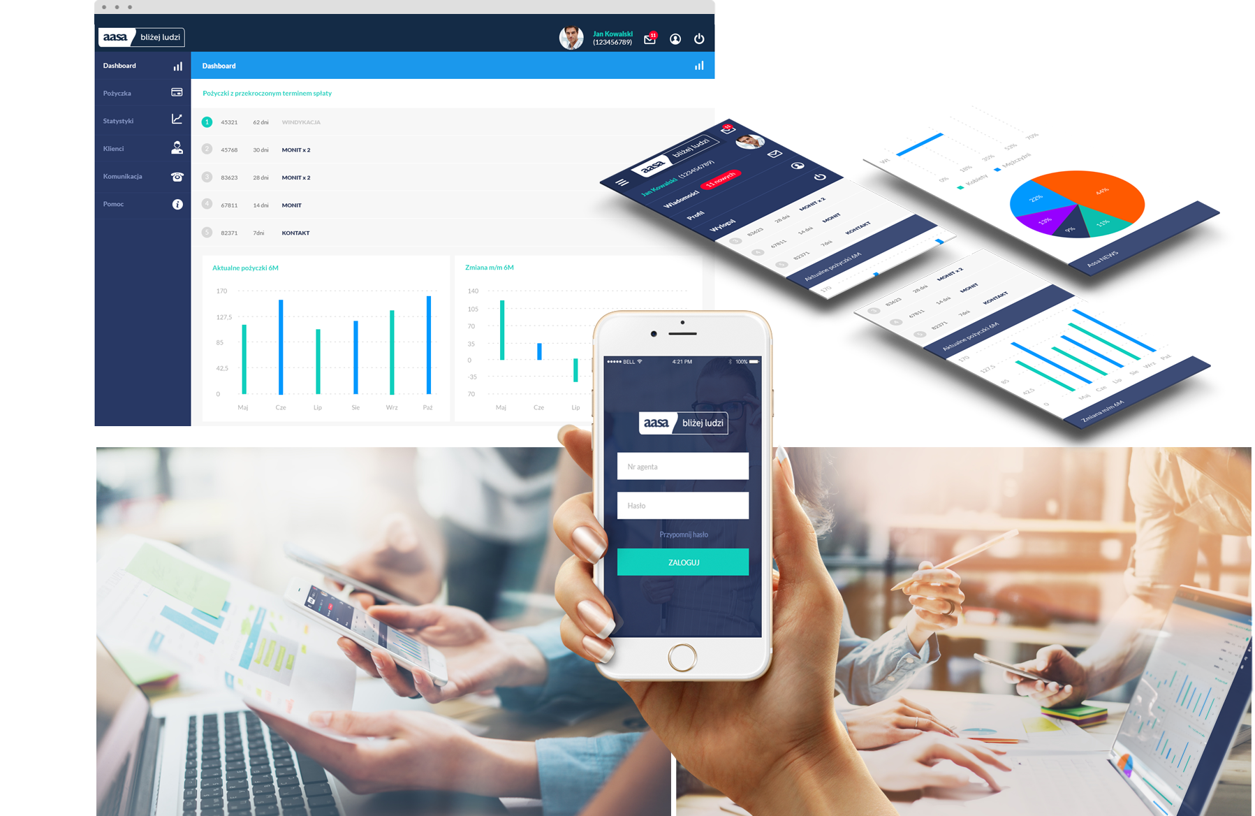
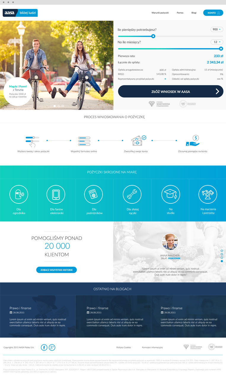
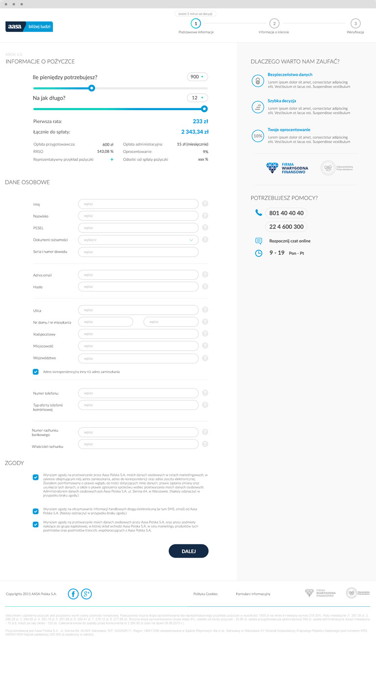
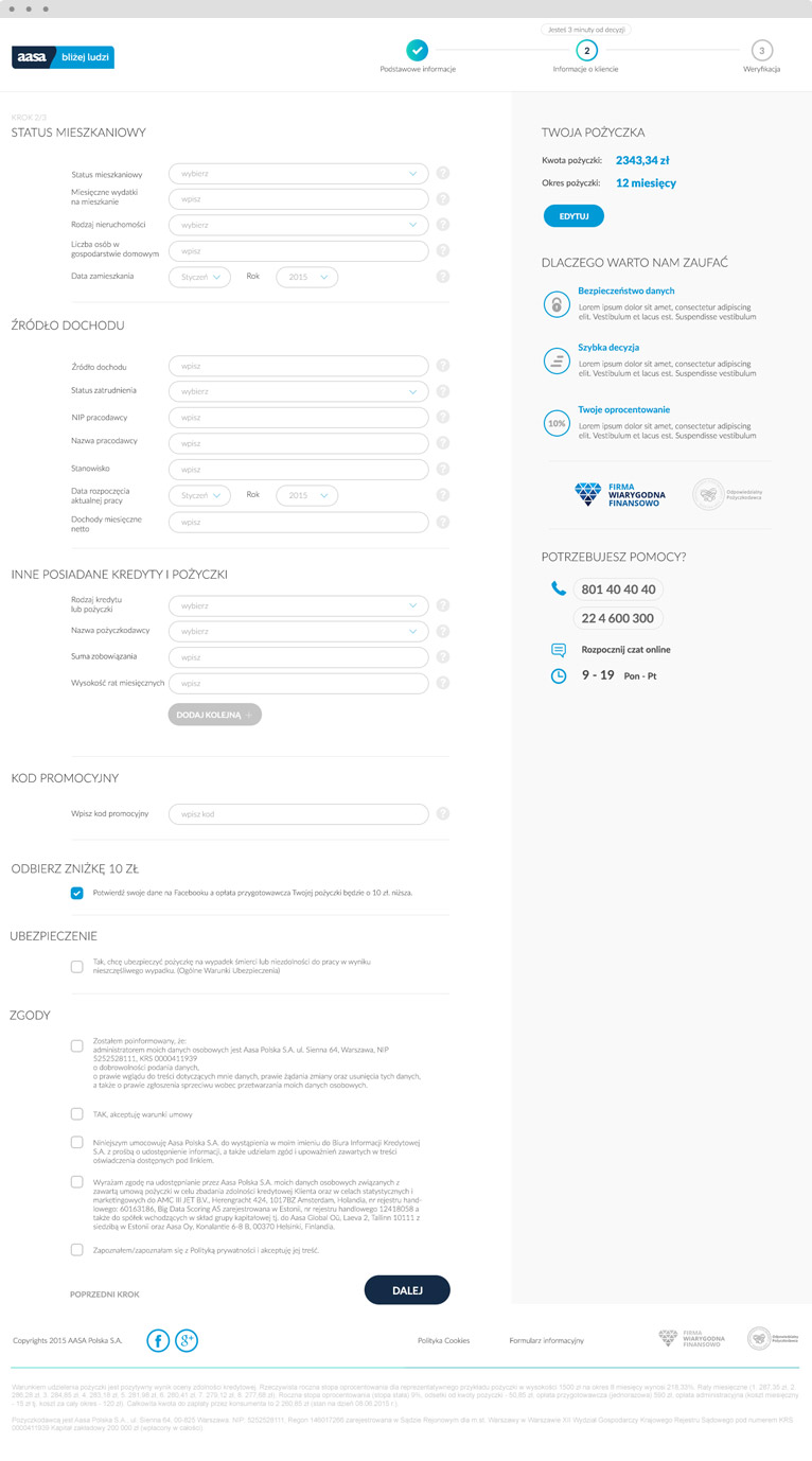
The new website, aasapolska.pl, is an intuitive and fully responsive website which functions elegantly across all devices. The main element of the website is the Customer Panel, which allows users to simply calculate the amount of their loans, find all of the necessary terms and conditions, and have their applications approved with just a few quick clicks.
We also made sure that the website was constructed with a number of visual elements to make it engaging and easy to understand. All of users repayment dates are visible at a glance and an attractive slider tool and accompanying infographic showing the operating principles of the service.
The new AASA website looks great, but more importantly it is programmed well and works smoothly for customers accessing it across all devices. By putting the customer first, we have created a website which is completely in line with the brand philosophy and will help their users to make the most of the service.
PROJECT LEAD

Adam Mucha
How about talking with
Adam about how experience
he gained in this project
can be a help in achievieng
your goals.
LOGO


TYPOGRAPHY


COLOURS


