BADPONY
BRANDING, E-COMMERCE & GRPAHIC DESIGNS
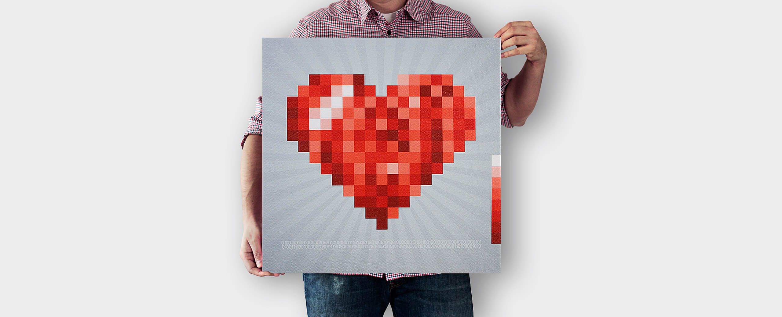

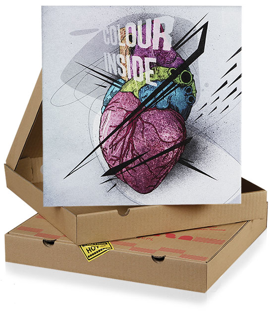
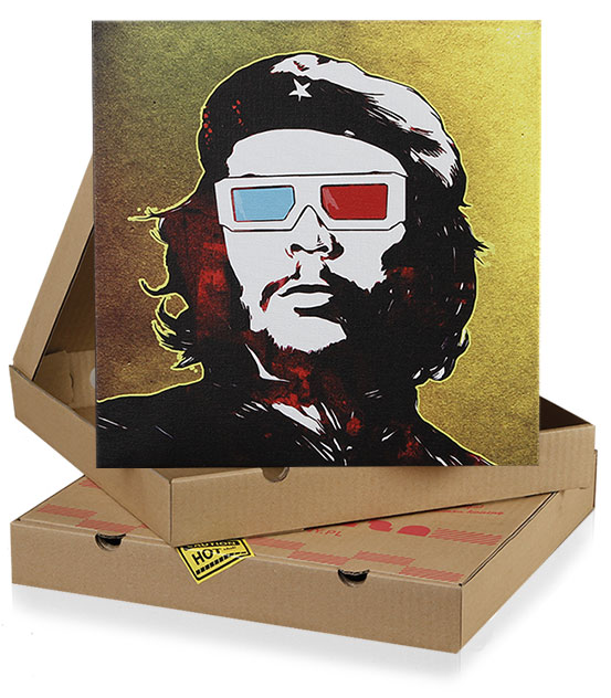
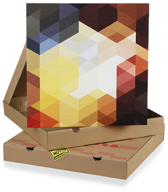
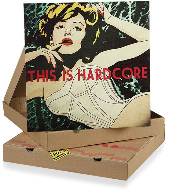
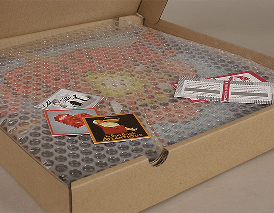
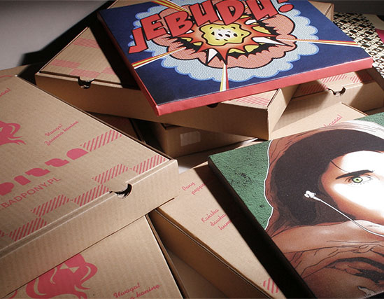
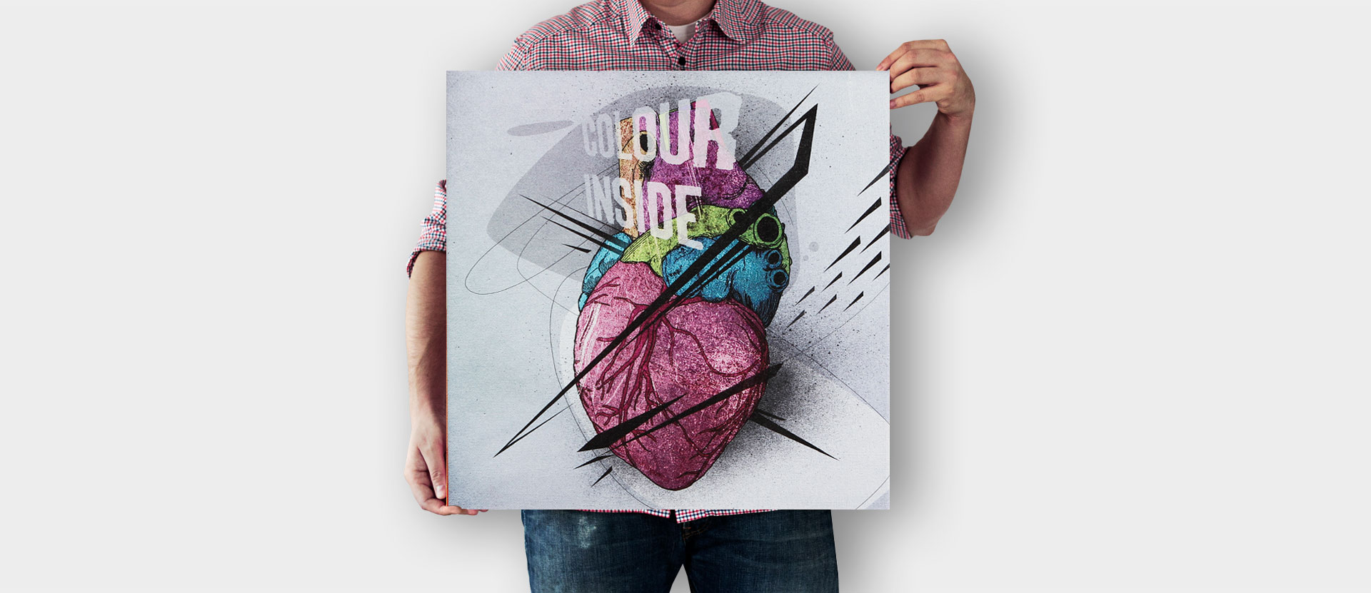
Bad Pony approached us as a young startup, looking to establish them as an online store selling a range of witty and artistic canvas prints.
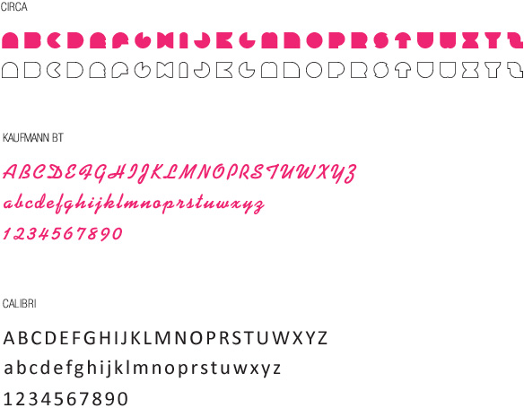
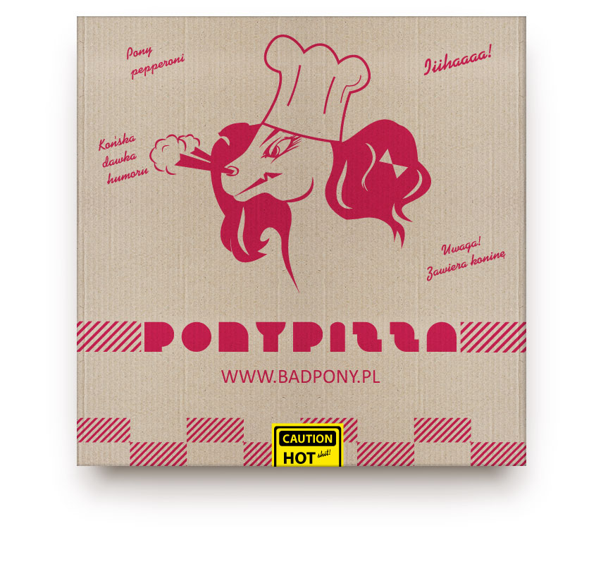
We started from a blank canvas when it came to brand development, and worked with the client to craft a perfect image which matched their idea of the company. This meant that the brand should be positive and tasteful but with a hint of anarchy at its core; just like the name suggests. To create the perfect mixture we combined the sweet pink colour you might associate with a pony with some gently provocative graphics – giving it a fun feel.
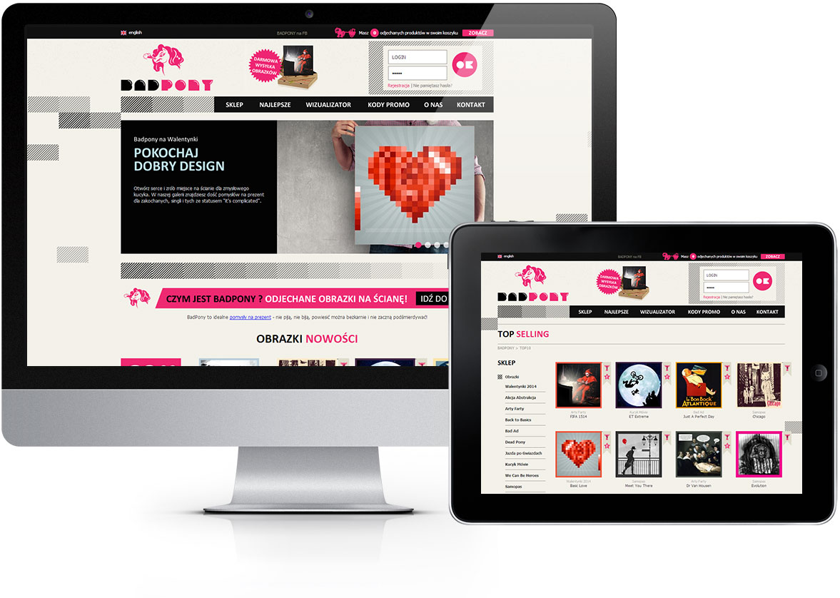
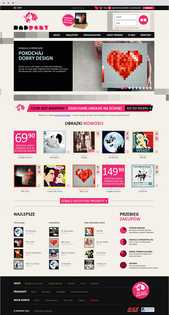
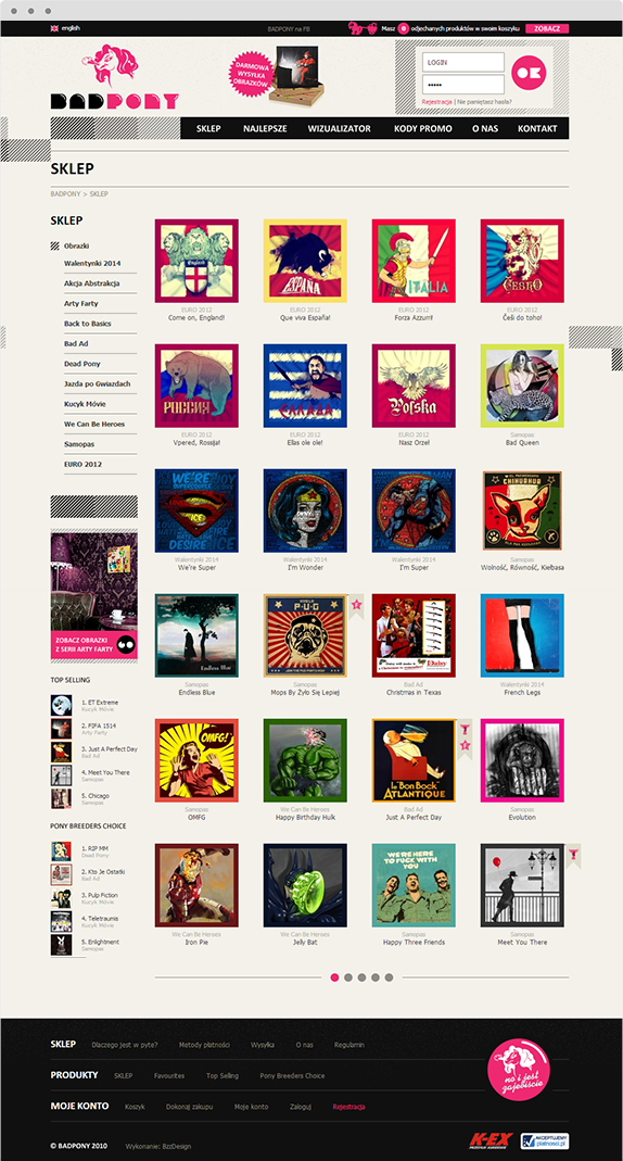
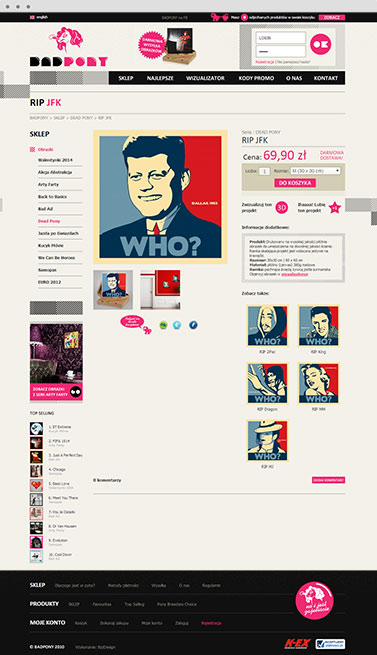
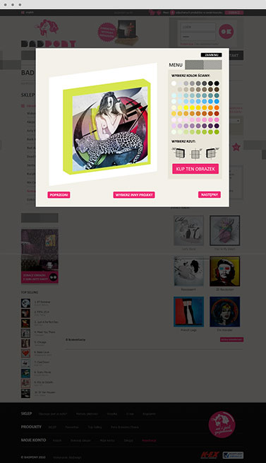
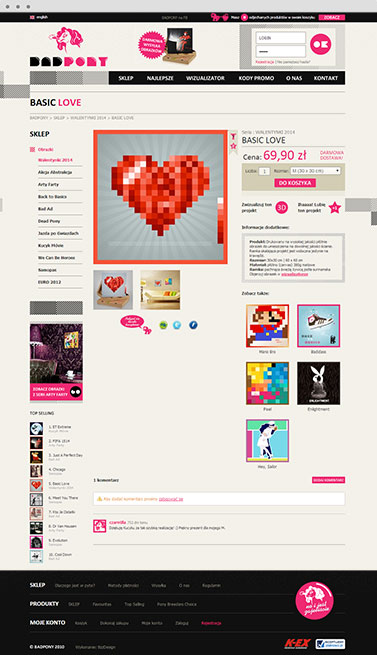
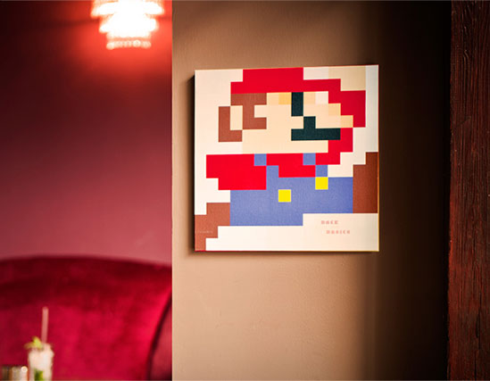
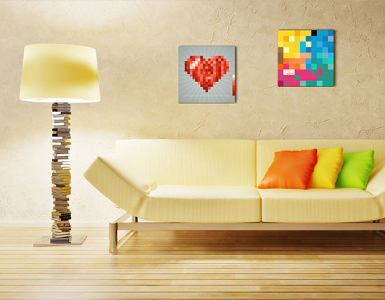
When it came to creating the website itself, a modern design seemed natural and the bold shapes and colours we chose complement the brand identity impeccably. The website does not just look great, it also offers excellent functionality and practical features. The site is accessible in both Polish and English, and includes options for users to like, rate, comment and visualize the images in 3D on a wall of a chosen colour. Thanks to this slick website and company’s unique products, they have found great success and are now decorating many more rooms across Europe.
PROJECT LEAD

Adam Mucha
How about talking with
Adam about how experience
he gained in this project
can be a help in achievieng
your goals.
LOGO

COLOURS


TYPOGRAPHY
